 Introduction PHOTOstudio 3Dstudio MATERIALstudio SHOW SPECTRUM_cloud Extras Download
 | 4. EXPLORER 4.1 Menu bar in Explorer 4.1.1 Data view 4.1.2. Search 4.1.3. Help 4.1.4. Filters 4.1.5. Favourites 4.2 Projects tab 4.2.1 Samples EXTERIOR/INTERIOR 4.2.2 Own projects 4.2.3 Additional menu 4.3 Collections tab 4.3.1 Colour and material selection 4.3.2 Own collections 4.4 Filters 4.5 Favourites |
4.1 Menu bar in EXPLORER
4.1.1 Data views You can choose between five different views for presentation of the sample images, colours and materials in the EXPLORER in SPECTRUM 5: 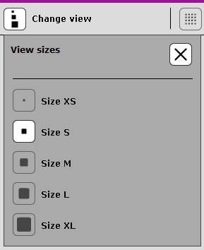 View sizes XS and S
This minimised view of all images, colours and materials, without any other product information, is ideal for viewing as many products as possible at a glance, to gain an overview. View size M This view provides you with a larger presentation of the product as well as the product name and for colours and materials, the Info button for detailed information for the product (see chapter 4.3.1, Colour and material selection). This view is particularly suitable for having a look at many products at once and seeing the initial product information. This is the default view size for products. View sizes L and XL This view shows the image, colour and material data in a large view with the possibility of a detailed information display with the Info button (see chapter 4.3.1, Colour and material selection). It is especially suitable for viewing product details during a search. List view  Under Projects, this view shows or hides the library images with the three professional colour schemes. This gives you a quick overview of all available images. Note: You can also change views with View in the main navigation.
|